COVID-19 in San Francisco

Description
This data project takes a look at Covid-19 data in San Francisco during the course of the pandemic. Some of the key
ranges can be seen by looking at the visualizations created through SQL queries. It is broken down into three
categories; vaccines taken, positive cases, and deaths. The data was pulled from data.ca.gov and was then cleaned
up in Excel before being brought into an SQL database I created. After running queries for the datasets, I imported
them into Tableau to create visualizations for display.
Some points of interest for the data set includes spikes in cases around the holidays, namely in the winter time.
In regards with vaccines taken, there was an immediate desire for getting the vaccine followed by a big drop off
over time. The data gathered for vaccines taken included data for first dose, second dose, and single dose vaccines.
The data above strictly shows individuals who were considered "fully vaccinated", meaning they completed both doses
required for their vaccine or they completed their single dose vaccine.
Workflow
• Import into Excel and clean up data
• Create database and tables using SQL
• Import data into database and run queries
• Save queries for ease of use and importing
• Import into Tableau and create visualization
• Analyze dataset for trends & points of interest
Links
California Open DataTableau
PostgreSQL
Excel

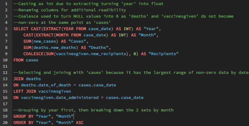
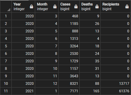
Breakdown of Cases, Deaths, and Recipients of vaccine, year by year

SQL query

Results of above query
